Indicator findings

This section provides the key findings for each of the indicators (PM10 concentrations, PM2.5 concentrations, nitrogen dioxide concentrations, sulphur dioxide concentrations, ground-level ozone concentrations, carbon monoxide concentrations, air pollutant emissions, and the health impacts of air pollution), an overview of how the data are collected and assessed, and links to more detailed information available on the Stats NZ web pages.

Image: Ministry for the Environment
In New Zealand and around the world, the most significant human health impacts from poor air quality are associated with exposure to particulate matter (PM) (Health Effects Institute, 2018). Particulate matter is a term used for a mixture of solid particles and liquid droplets found in the air (US EPA, 2021). This report refers to two types of particulate matter:
There is considerable evidence that inhaling PM is harmful to human health, especially when of smaller particle size, such as PM2.5 and finer. PM2.5 can be particularly harmful because these particles can become trapped in the small airways deep in the lungs. When particles are very fine (PM0.1) they can enter the bloodstream and penetrate organs in the body (EFCA, 2019).
Short- and long-term exposure to PM, even at low levels, can lead to a range of health impacts especially in vulnerable people (the young, the elderly, and people with existing respiratory conditions). At the less-severe end, it can cause temporary and reversible effects such as shortness of breath, coughing, or chest pain. However, there is strong evidence of more severe effects, namely, illness and premature death from heart attacks, strokes, or emphysema (where the air sacs in the lungs are damaged). Exposure to PM can also cause lung cancer and exacerbate asthma. Studies point to possible links with diabetes and atherosclerosis (the accumulation of fat, cholesterol, and other substances on artery walls, reducing blood flow) as a result of increased inflammation caused by particulate matter (WHO, 2013).
Particulate matter emissions typically result from combustion (such as burning petrol, diesel, wood, or coal) and abrasion processes (such as brake and tyre wear or road dust). Combustion tends to create fine particles (PM2.5), whereas abrasion generates coarser particles (PM10). Particulate matter can also be generated through the reaction of gases in the atmosphere (referred to as secondary particulate matter), and a proportion of particulate matter is naturally occurring, for example, sea salt.
A study by Talbot et al, (2021a, b) found that during the COVID-19 lockdown (alert level 4) in 2020, PM10 concentrations decreased by between 11.5 and 34.1 percent across New Zealand. As the restrictions eased, concentrations of PM10 increased. The scale of increase was more significant in southern regions, perhaps because the burning of wood for home heating is more prevalent during the colder months.
Regional councils and unitary authorities monitor PM10 concentrations in their regions. Data from 46 sites for state and 48 for trends, located across 14 regions, were used in this report.
In New Zealand, short-term exposure to PM10 is assessed against the National Environmental Standards for Air Quality (NESAQ), which allows for a 24-hour average of 50 micrograms per cubic metre (μg/m3) (one exceedance per year is permitted under the standard). Long-term exposure is assessed against the 2005 World Health Organization (WHO) annual average air quality guidelines (AQG) of 20 μg/m3.
We also assess against the more stringent AQGs that the WHO recommended in September 2021 for PM10: a 24-hour average of 45 μg/m3 and an annual average of 15 μg/m3.
Trends were analysed for sites with at least six complete years of data. All trends were assessed at the 95 percent confidence level. Where a trend was ‘indeterminate’, there was not enough certainty to determine a trend direction.
2005 air quality guidelines
2021 air quality guidelines
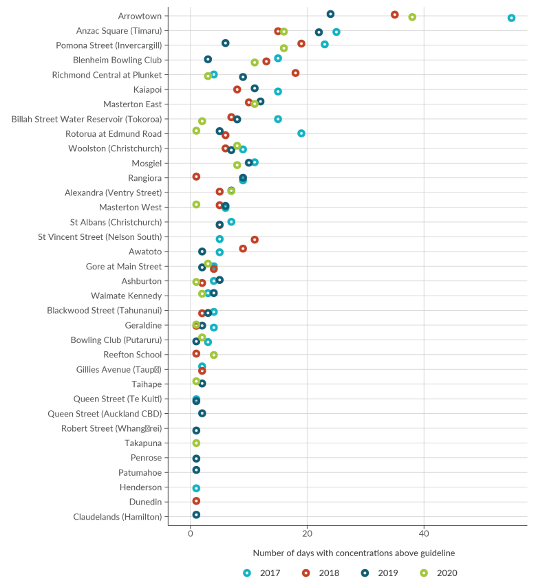
Image: Data source — Regional councils, unitary authorities
Arrowtown is the site with the most days above the guideline, ranging between 24 days in 2019 to 55 days in 2017.
Anzac square (Timaru) is the site with the second most days above the guideline, ranging between 15 days in 2018 to 25 days in 2017.
Pomona Street (Invercargill) is the site with third most days above the guideline, ranging between six days in 2019 to 23 days in 2017.
Sites such as Robert Street (Whangārei), Takapuna, Penrose, Patumahoe, Henderson, Dunedin, and Claudelands (Hamilton) have the lowest number of days with concentrations above the guideline; each with only one day.
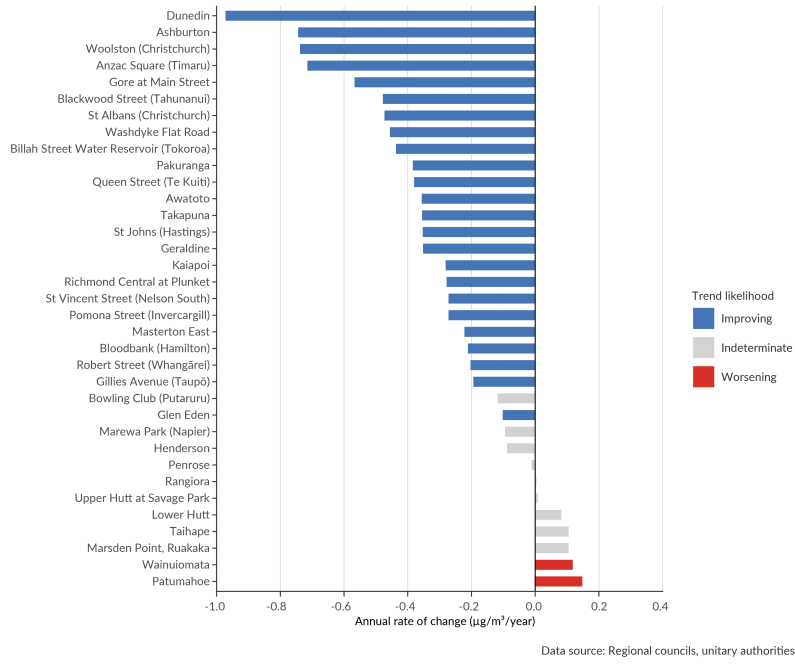
Image: Data source — Regional councils, unitary authorities
The length of the bars is proportional to the annual rate of change in concentration of PM10.
The bars are coloured by the trend likelihood; either improving, indeterminate, or worsening.
Dunedin, Ashburton, and Woolston (Christchurch) are the fastest improving sites.
Patumahoe, Wainuiomata, and Marsden Point, Ruakaka are the fastest worsening sites.
Regional councils and unitary authorities monitor PM2.5 concentrations in their regions. Data from 19 sites for state and 12 for trends, located across nine regions, were used in this report.
New Zealand is one of the few developed countries without a 24-hour average standard for PM2.5. Consequently, short-term exposure to PM2.5 has been assessed against the 2005 WHO 24-hour average guideline of 25 μg/m3. Long-term exposure is assessed against the 2005 WHO annual average guideline of 10 μg/m3.
We also assess against the more stringent air quality guidelines that the World Health Organization recommended in September 2021 for PM2.5: 24-hour average of 15 μg/m3 and an annual average of 5 μg/m3.
2005 air quality guidelines
2021 air quality guidelines
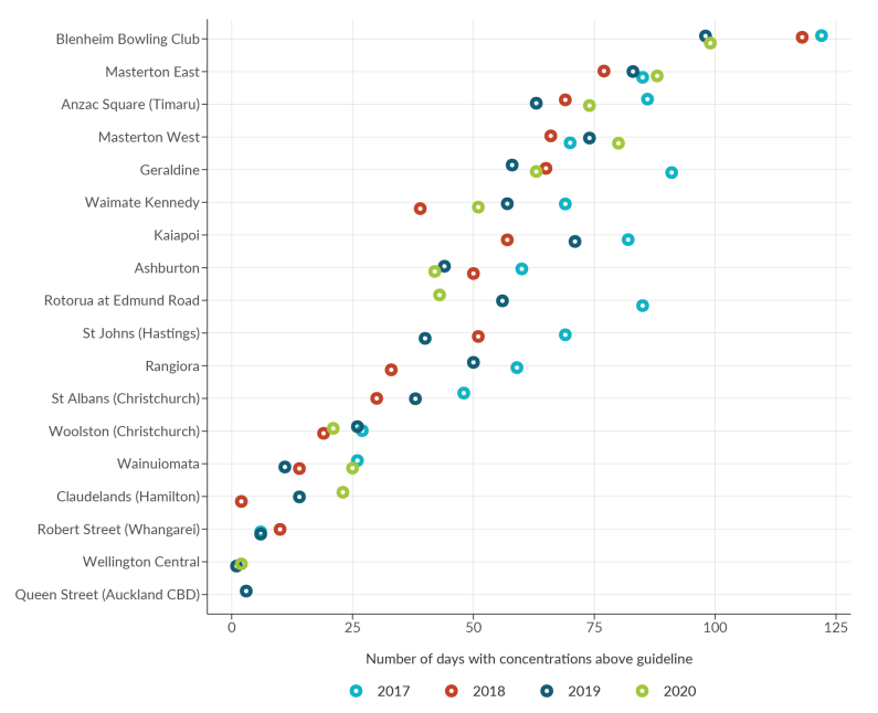
Image: Data source — Regional councils, unitary authorities
Blenheim Bowling Club is the site with the most days above the guideline, ranging between 98 days in 2019 to 122 days in 2017.
Masterton East is the site with the second most days above the guideline, ranging between 77 days in 2018 to 88 days in 2020.
Anzac Square (Timaru) is the site with third most days above the guideline, ranging between 63 days in 2019 to 86 days in 2017.
Wellington Central and Queen Street (Auckland CBD) are the sites with the lowest number of days above the guideline. Wellington Central had one day in 2019, and two days in 2020. Queen Street (Auckland CBD) had three days in 2019.
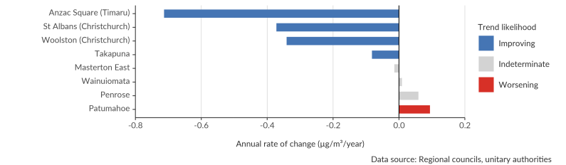
Image: Data source — Regional councils, unitary authorities
The length of the bars is proportional to the annual rate of change in concentration of PM2.5.
The bars are coloured by the trend likelihood; either improving, indeterminate, or worsening.
Anzac Square (Timaru), St Albans (Christchurch) and Woolston (Christchurch) are the fastest improving sites.
Patumahoe is the only worsening site.
Nitrogen dioxide (NO2) is a gas primarily generated by burning fossil fuels, mainly by motor vehicles (particularly diesel vehicles) but also from industrial emissions and home heating. Because nitrogen dioxide concentrations are closely associated with vehicle emissions, they can be used as a proxy for other motor vehicle-related pollutants such as benzene, black carbon (a form of PM2.5, also known as soot), and volatile organic compounds.
There are health impacts from short-term and long-term exposure to nitrogen dioxide. Short-term exposure to high concentrations of nitrogen dioxide causes inflammation of the airways and respiratory problems and can cause asthma attacks (US EPA, 2016). Short-term exposure may also trigger heart attacks and increase the risk of premature death (US EPA, 2016). Long-term exposure may cause asthma to develop and lead to decreased lung development in children. It may also increase the risk of certain forms of cancer and premature death (US EPA, 2016). Nitrogen dioxide also contributes to brown haze, which occurs in Auckland, and which is associated with an increase in hospital admissions.
Nitrogen dioxide also contributes to the formation of ground-level ozone and secondary particulate matter (when gases in the atmosphere react in the presence of sunlight), both of which can have negative health impacts.
Nitrogen dioxide can also have ecological impacts. It can cause injury to plant leaves and reduce growth in plants that are directly exposed to high levels (US EPA, 2008). In the atmosphere, nitrogen dioxide can combine with water to form nitrate, which has been shown to cause acidification and have negative effects on freshwater ecosystems. It can also affect ecosystems by acting as a nutrient (Payne et al, 2017).
New Zealand’s COVID-19 response in 2020 led to a notable short-term improvement in air quality, particularly as a result of decreased nitrogen dioxide concentrations due to reduced traffic emissions (Talbot et al, 2021a, b). During the most restrictive alert level period (level 4), nitrogen dioxide concentrations reduced by 34 to 66 percent. The speed of the ‘bounce-back’ in concentrations varied according to location, but largely increased in line with increases in on-road vehicle volume as restrictions eased.
The National Environmental Standards for Air Quality (NESAQ) for nitrogen dioxide requires regional councils and unitary authorities to undertake monitoring where nitrogen dioxide concentrations may be likely to breach the standard. Data from seven sites for state and nine for trends, located across three regions, were used in this report.
Because motor-vehicle emissions are the major source of nitrogen dioxide, the Waka Kotahi NZ Transport Agency also operates a network of passive nitrogen dioxide samplers at sites near roads, and urban background areas. These types of samplers do not meet regulatory standards but do allow for more widespread and cost-effective data collection. As such, this monitoring can provide information on concentrations but cannot be used to assess compliance with the nitrogen dioxide standard. Data from 186 sites for state and 110 for trends, located across 16 regions, were used in this report.
In New Zealand, short-term exposure to nitrogen dioxide is assessed against the NESAQ 1-hour average standard of 200 μg/m3 (nine exceedances are allowed per year), and long-term exposure is assessed against the 2005 WHO annual average guideline of 40 μg/m3.
We also assess against the more stringent air quality guidelines that the WHO recommended in September 2021 for NO2: a 24-hour average of 25 μg/m3 and an annual average of 10 μg/m3.
2005 air quality guidelines
2021 air quality guidelines

Image: Data source — Regional councils, unitary authorities
Riccarton Road (Christchurch) and Queen Street (Auckland CBD) have the most days above the guideline.
Riccarton Road (Christchurch) exceeded every year, ranging between 179 days in 2020 to 271 days in 2017.
Queen Street exceeded in 2018, 2020, and 2017, ranging between 294 days in 2018 to 309 days in 2017.
Wellington Central had the lowest number of days with concentrations above the guideline; ranging 16 days in both 2018 and 2019, and 24 days in 2020.
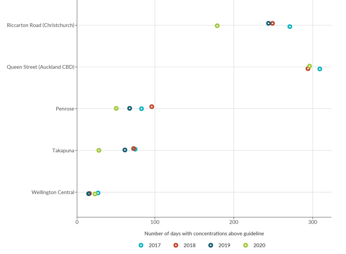
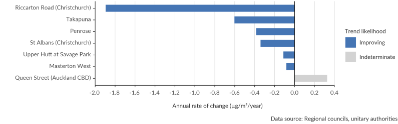
Image: Data source — Regional councils, unitary authorities
The length of the bars is proportional to the annual rate of change in concentration of nitrogen dioxide.
The bars are coloured by the trend likelihood; either improving, or indeterminate. There were no worsening sites.
Riccarton Road (Christchurch), Takapuna, and Penrose are the fastest improving sites.
Queen Street (Auckland CBD) is the only indeterminate site.
Sulphur dioxide (SO2) is a colourless gas with a sharp, irritating odour. It is associated with combustion of fossil fuels (such as coal, diesel, and heavy fuel oil used in maritime vessels) and industrial processes (such as the production of fertilisers and the smelting of mineral ores containing sulphur). Geothermal and volcanic gases are natural sources of sulphur dioxide in New Zealand.
At high levels, sulphur dioxide can have human health and ecological impacts. When inhaled, sulphur dioxide is associated with respiratory problems such as bronchitis. It can aggravate the symptoms of asthma and chronic lung disease and cause irritation to eyes.
It can also interact with other compounds in the air to form sulphate particulate matter, a secondary pollutant. Sulphate particulate matter is associated with significant health effects because of its small size and acidity. It is also a cause of haze, which impairs visibility.
In ecosystems, it can damage vegetation, acidify water and soil (US EPA, 2017), and affect biodiversity.
Regional councils and unitary authorities monitor sulphur dioxide concentrations in their regions. Data from seven sites for state and six for trends, located across three regions, were used in this report.
In New Zealand, short-term exposure to sulphur dioxide is assessed against the NESAQ 1-hour average standard of 350 μg/m3 (lower) (nine exceedances are allowed per year) and 570 μg/m3 (upper), and the 2005 WHO 24-hour average guideline of 20 μg/m3.
We also assess against the less stringent air quality guideline that the WHO recommended in September 2021 for sulphur dioxide: a 24-hour average of 40 μg/m3.
2005 air quality guidelines
2021 air quality guidelines
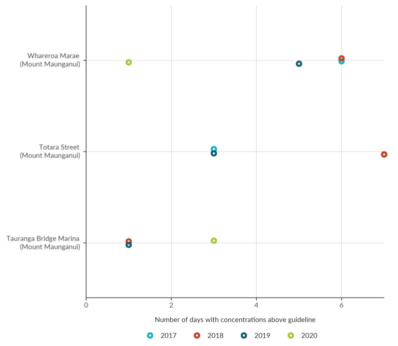
Image: Data source — Regional councils, unitary authorities
Whareroa Marae (Mount Maunganui) was above the guideline one day in 2020, five days in 2019, six days in 2018, and six days in 2017.
Totara Street (Mount Maunganui) was above the guideline three days in 2019, seven days in 2018, and three days in 2017
Tauranga Bridge Marine (Mount Maunganui) was above the guideline three days in 2020, one day in 2019, and one day in 2018.
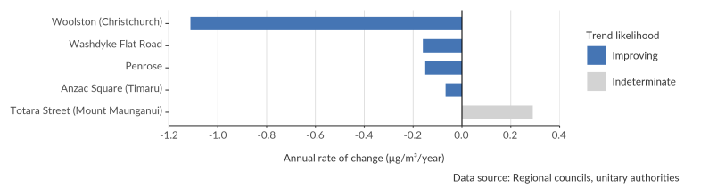
Image: Data source — Regional councils, unitary authorities
The length of the bars is proportional to the annual rate of change in concentration of sulphur dioxide.
The bars are coloured by the trend likelihood; either improving, or indeterminate. There were no worsening sites.
Woolston (Christchurch), Washdyke Flat Road, and Penrose were the fastest improving sites. Anzac Square (Timaru) was also improving.
Totara Street (Mount Maunganui) is the only indeterminate site.
Ozone (O3) is a gas found naturally in the atmosphere. However, ozone at ground level is a pollutant primarily generated by human activity that can have harmful effects. Ground-level ozone forms when nitrogen oxides and volatile organic compounds (generated by sources such as motor vehicles and industrial processes) combine in the presence of sunlight.
Exposure to high concentrations of ground-level ozone can cause respiratory health issues and is linked to cardiovascular health problems and increased mortality. Those most at risk include children, older adults, people with asthma, and people who spend a lot of time outdoors, such as outdoor workers. Exposure to ground-level ozone may also be associated with effects on the nervous and reproductive systems, and other developmental effects (WHO, 2013).
High levels of ground-level ozone can also have harmful ecological effects: it can damage vegetation, reduce plant growth (affecting crop and forest yields), and harm sensitive ecosystems (US EPA, 2013).
Two regional councils monitor ground-level ozone concentrations. Data from two sites (in Auckland and Wellington) for state and one site (in Auckland) for trends, were used in this report.
In New Zealand, short-term exposure to ground-level ozone is assessed against the NESAQ 1-hour average standard of 150 μg/m3 and the 2005 WHO eight-hour average guideline of 100 μg/m3.
We also assess against the air quality guidelines that the WHO recommended in September 2021 for ground-level ozone: an eight-hour average of 100 μg/m3 (no change) and a peak season* eight-hour average of 60 μg/m3.
*Average daily maximum 8-hour mean O3 concentration in the six consecutive months with the highest six-month running-average O3 concentration.
2005 air quality guidelines
2021 air quality guidelines
See indicator: Ground-level ozone concentrations (Stats NZ).
Carbon monoxide (CO) is caused by the incomplete combustion of fuels, especially in petrol-fueled motor vehicles. However, exposure to carbon monoxide has been dramatically reduced since the introduction of emission standards in the year 2000, which required catalytic converters (an exhaust emission control device that converts toxic gases and pollutants into less-toxic pollutants) to be installed in most vehicles (Bluett et al, 2016).
Carbon monoxide can have a range of health effects even after short-term exposure to relatively low concentrations. When inhaled, carbon monoxide enters the blood stream and attaches to haemoglobin in red blood cells, which transport oxygen around the body. This reduces the amount of oxygen that body tissues receive and can have adverse effects on the brain, heart, and general health. Exposure to low levels can causes dizziness, weakness, nausea, confusion, and disorientation. However, higher levels can cause collapse, loss of consciousness, coma, and death (US EPA, 2010).
Two regional councils monitor carbon monoxide concentrations. Data from six sites for state and 12 for trends, located across two regions (Wellington and Canterbury), were used in this report.
In New Zealand, short-term exposure to carbon monoxide is assessed against the NESAQ running 8-hour average standard of 10 mg/m3 (one exceedance permitted per year) and the 2010 WHO 1-hour average guideline of 35 mg/m3 (WHO, 2010).
We also assess against the air quality guidelines that the WHO recommended in September 2021 for CO: a 24-hour average of 4 mg/m3.
2010 air quality guidelines
2021 air quality guidelines

Image: Data source — Regional councils, unitary authorities
The length of the bars is proportional too the average daily concentration of carbon monoxide.
Riccarton Road (Christchurch) had the highest average concentrations of carbon monoxide (0.4 mg/m3). The rest of the sites had average concentrations of 0.2 mg/m3.
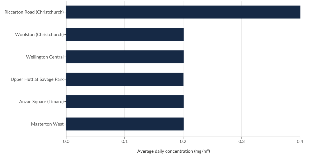
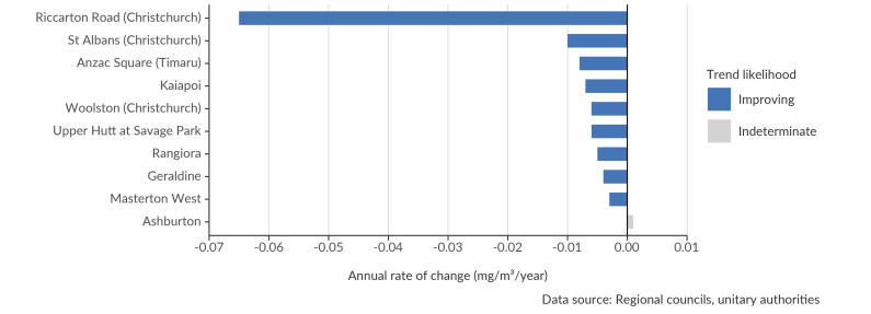
Image: Data source — Regional councils, unitary authorities
The length of the bars is proportional to the annual rate of change in concentration of carbon monoxide.
The bars are coloured by the trend likelihood; either improving, or indeterminate. There were no worsening sites.
Riccarton Road (Christchurch) was improving much faster than any other site, at a rate of -0.065 mg/m3/year. Compared with the next fastest site, St Albans (Christchurch) which was improving at a rate of -0.010 mg/m3/year.
Rangiora, Geraldine, and Ashburton sites had indeterminate trends.
Understanding the key sources of air pollutants is critical to managing and improving air quality. Emissions inventories estimate the quantities of pollutants emitted to the air by various sources over a certain time period.
Emissions inventories can provide information on the relative contributions of different sources and how they change over time, but they have a level of uncertainty in their estimates. For this report, an air pollutant emissions inventory was developed to examine sources of particulate matter and gaseous pollutants.
The primary method in the inventory is to use readily available information at a national scale (such as fuel use or production volume) and translate it into the amount of pollution emitted. This method provides national-level emission estimates that are easily updatable, consistent over time, and more complete in terms of sources. An alternative method is direct measurement of emissions at the source, aggregated up to a national total.
A national emissions inventory was developed for the following air pollutants in New Zealand – PM10, PM2.5, nitrogen oxides (NOX), carbon monoxide (CO), and sulphur dioxide (SO2).
This indicator presents data from 2012 up to and including 2019. The year covered by the Greenhouse Gas Inventory (which is a major input to the air pollutant emissions inventory) is 15 months behind the current calendar year to give countries time to collect and process the inventory data and prepare their submission (international reporting guidelines govern what the greenhouse inventory covers and when it is submitted).
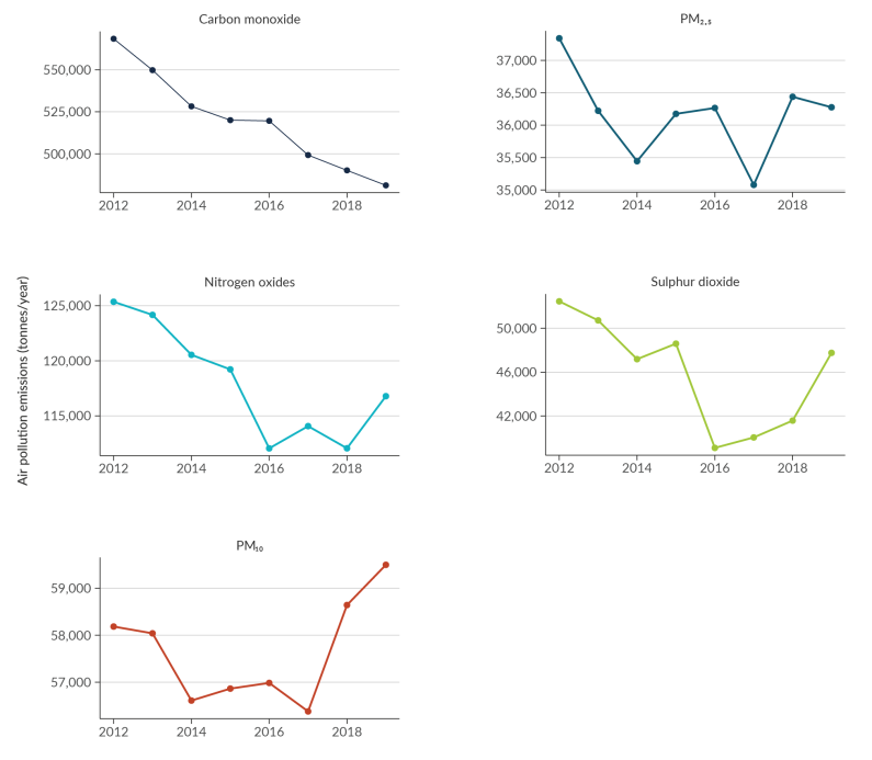
Image: Data source — Stats NZ
Carbon monoxide shows a line which declines fairly steadily from 568,420 tonnes per year in 2012 to 481,299 tonnes per year in 2019.
Nitrogen oxides shows a line which declines between 2012 and 2016, but then wiggles around between 2018 and 2019. Emissions of nitrogen oxides were 125,356 tonnes per year in 2012 and 116,788 tonnes per year in 2019.
PM10 shows a line which initially decreases, but then has a sharp increase from 2017 to 2019. Emissions of PM10 were 58,184 in 2012 and 59,499 in 2019.
PM2.5 shows a line which initially decreases between 2012 to 2014, and then wiggles around. Emissions of PM2.5 were 37,340 in 2012 and 36,276 in 2019.
Sulphur dioxide shows a line which mostly decreases between 2012 to 2016, but then has a sharp increase between 2016 and 2018. Emissions of sulphur dioxide were 52,463 in 2012 and 47,760 in 2019.
Air pollution causes a wide range of health impacts. There are numerous international studies on the effects that air pollutants can have on human health, but few studies have measured the health impacts in Aotearoa New Zealand. One New Zealand-based study found that living in a neighbourhood with a higher density of wood burners was associated with an increased risk (28 percent) of nonaccidental emergency department visits in children younger than three years old (Lai et al, 2017).
Due to the difficulty of separating air pollution effects from other causes, modelling is commonly used to estimate health impacts from air pollution. This indicator uses a modelling methodology informed by the Health and Air Pollution in New Zealand (HAPINZ) (2012) study, which was developed in accordance with international best practice (Kuschel et al, 2012).
Note: We are anticipating that this indicator will be updated soon, pending an update to the model. Updated information will be available on the Stats NZ website. This indicator used PM10 as a proxy for all air pollution in New Zealand but the revision currently underway will report on PM2.5 and nitrogen dioxide.
From modelling based on the current Health and Air Pollution in New Zealand (HAPINZ) model (table 2):
It should be noted that the improvement in health effects from air pollution demonstrated by the data above appears to be largely due to more people living in areas with lower PM10 concentrations, such as Auckland, rather than a reduction in PM10 levels overall. While concentrations have decreased markedly in some other areas, these make only a minor contribution to health impacts calculations because of the smaller populations that are exposed.
| Health effect | Number of cases per 100,000 people | ||
|---|---|---|---|
| 2006 | 2016 | ||
| Premature mortality (adults 30+) | 29 | 27 | |
| Hospital admissions | Cardiac hospital admissions | 6 | 5 |
| Respiratory hospital admissions | 9 | 9 | |
| Total hospital admissions | 15 | 14 | |
| Restricted activity days | 36,300 | 31,800 | |
Source: HAPINZ Exposure Model (Kuschel et al, 2012), Emission Impossible Ltd

Indicator findings
December 2021
© Ministry for the Environment