Chapter 3: Changes in our climate and environment are being observed

Climate change has well and truly arrived in New Zealand and is affecting the climate where we live.

Image: Alan Blacklock, NIWA
The annual average temperature in Aotearoa New Zealand continues to increase. Measurements between 1972 and 2019 showed increases in the annual average temperature at 28 of 30 sites, and at every site during winter. Daily average high and low temperatures also increased at many of the sites, and the growing season has lengthened.
Temperature extremes can cause serious risks to our health, and these have been changing. Warm days, where the daily high is above 25 degrees Celsius, very likely increased at nearly two thirds of sites. The annual number of heatwave days increased at more than half of all sites, while frost days decreased in many places.
The signals of changes to rainfall are also beginning to emerge. Annual rainfall either increased or decreased at 24 of 30 sites, and most of these also had changes to extreme rainfall. Changes to dry spells were observed, as well as changes to the frequency and intensity of drought.
The warmer atmosphere and changed rainfall is already translating to impacts on other parts of the physical environment, like our soils, oceans, and glaciers. The volume of ice in our glaciers has decreased, and changes to wildfire risk have been observed in some places. The changes are unmistakable in the oceans, which are rising, warming, and becoming more acidic.
(See Measuring and reporting trends and anomalies for information about how increases and decreases are reported.)
In 2019, the annual average land-surface temperature in New Zealand was the fourth highest since records began in 1909 (see figure 9). It has risen by 1.13 (± 0.27) degrees Celsius in these 111 years. (See indicator: Temperature.) Of the past 20 years, 16 have recorded above average temperatures compared with the average for the 1961–90 reference period. Overall, the national average temperature increased by 0.10 degrees Celsius per decade since 1909, but that rate was 0.31 degrees Celsius per decade in the past 30 years.
Evidence from sediments, pollen, and ice suggests it has been about 10,000 years since the average annual temperature in New Zealand was as high as it is today. The temperatures we are now experiencing are therefore likely to be near the top of the range that current ecosystems have experienced (MfE, 1997).

Image: NIWA (Data source)
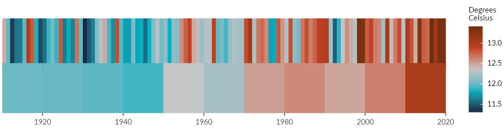
Image: NIWA (Data source)
Trends are classified as ‘very likely’ when there is a greater than 90 percent certainty of an increasing or decreasing trend. A ‘likely’ trend is greater than 66 percent certain and an ‘indeterminate’ trend is reported when there is not enough statistical certainty to say if a trend is going up or down. We report trends (for example, changes in temperature or rainfall over time) using likelihood categories describing the certainty of trends adapted from the Intergovernmental Panel on Climate Change (IPCC, 2014a).
Increasing or decreasing trends are calculated from all the sites where the trend was very likely or likely. Sites that had insufficient data were not included in the trend analysis. Note that Our atmosphere and climate 2017 used a different framework for reporting trends. When comparisons between reports are made, it is based on the trend likelihood framework used for this report.
The 30 years from 1961 to 1990 are used in this report as a reference or baseline period from which to measure anomalies (data points above or below a standard reference) as recommended by the World Meteorological Organization (WMO, 2017). This provides a benchmark against which contemporary observations can be compared.
The reference period is different from the periods used in weather reports – these use climate normals. Climate normals are 30-year averages that give information about what we can expect on a given day now, given the climate is warming. Averages are currently based on the 1981–2010 climate normal period. The normal period is updated every 10 years, with the next update scheduled for the end of 2020.
Using data from 30 sites around New Zealand allows for an in-depth look at how the climate is changing in different parts of the country. From 1972 to 2019, the annual average temperature increased at 28 sites (the increasing trend was statistically very likely at 25 sites and likely at 3), and no decreasing trends were found. (See indicator: Temperature and Measuring and reporting trends and anomalies.) Nelson had among the fastest increases in annual average temperature – an average rate of +0.29 degrees Celsius per decade, along with Reefton (+0.25 degrees Celsius per decade) and Tara Hills in inland Canterbury (+0.24 degrees Celsius per decade).
Some sites have already experienced years with an average temperature well above the 1961–90 reference temperature. In 2013, the average annual temperature in Dannevirke was +1.73 degrees Celsius higher. This was the largest temperature annual average anomaly observed for the 16 sites with enough data to calculate anomalies.
The warming observed in New Zealand is consistent with global observations. Worldwide, recorded temperatures have risen 1.0 degrees Celsius above pre-industrial levels, and 19 of the 20 warmest years have occurred since 2001. The past 6 years have been the warmest since records began in 1880 (IPCC, 2018; NASA, 2020).
While 1.0 degrees Celsius of global warming may not sound like a big increase, this rise in global surface temperature is part of an enormous accumulation of extra energy in the climate system (Trenberth, 2020). The difference between today’s climate and the climate during the last ice age (when large parts of Europe and North America were covered in ice) is 2–7 degrees Celsius, so changes that seem small can have major consequences (IPCC, 2013).
If you are on a mobile device, you can view the graph better on the StatsNZ website.
Winters are becoming warmer – average temperatures increased at all 30 sites (the trend was statistically very likely at 29 sites and likely at 1 site, see figure 10). Between 1972 and 2019 winters at Tara Hills warmed at an average rate of +0.41 degrees Celsius per decade. This was one of the highest rates of change at any site in any season. Nelson and Gore were also among the sites that had rapid changes in winter temperatures, with average increases of +0.35 and +0.33 degrees Celsius per decade respectively.
Winter had the most sites with increasing trends, although many of the largest temperature anomalies were recorded in summer. The hot summer in 2018 was unprecedented in New Zealand’s climate record. It resulted in average summer temperatures of more than 2 degrees Celsius above the 1961–90 baseline at 11 of the 30 sites, including Dannevirke, Nelson, and New Plymouth.
Changes in the seasons can affect our native plants, animals, and ecosystems, as well as how and when crops are grown. Changes can affect the flowering of some trees, when birds lay their eggs, and when species migrate. The timings and relationships that some mātauranga Māori is based on can also be affected. Warmer winters can mean less fuel needs to be burned to heat our homes. This could cause fewer emissions of air pollutants like particulate matter, the tiny particles in wood smoke. Warmer summers can increase heat stress (an inability to get rid of excess heat), which has serious health implications.
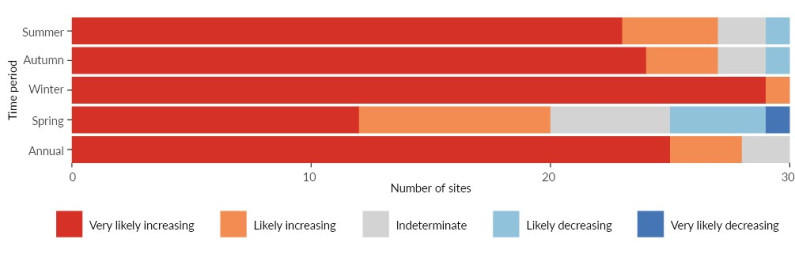
Image: NIWA (Data source)

Image: NIWA (Data source)
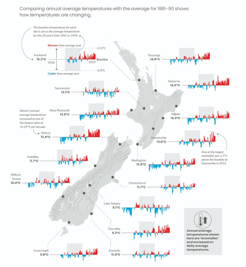
Image: Map data by Land Information New Zealand (CC BY 4.0)
Image: Map data by Land Information New Zealand (CC BY 4.0)
Read the long description for Average temperatures across New Zealand are increasing
Comparing annual average temperatures with the average for 1961-90 shows how temperatures are changing.
[map of New Zealand, with average temperature bar graphs plotted for 16 sites: Auckland, Tauranga, Gisborne, Taumaranui, New Plymouth, Napier, Dannevirke, Wellington, Nelson, Hokitika, Christchurch, Lake Tekapo, Tara Hills, Milford Sound, Dunedin, Invercargill].
The baseline temperature for each site is set as the average temperature for the 30 years from 1961 to 1990: the base temperature for Auckland is 15.2˚C, for Tauranga is 14.8˚C, for Gisborne is 14˚C , for Taumaranui 13.1 ˚C, for New Plymouth is 13.5 ˚C, for Napier is 14.3 ˚C, for Dannevirke is 12 ˚C, for Wellington is 12.8 ˚C, for Nelson is 12.4 ˚C, for Hokitika is 11.7 ˚C, for Christchurch is 11.7 ˚C, for Lake Tekapo is 9.1 ˚C, for Tara Hills is 9.2 ˚C, for Milford Sound is 10.4 ˚C, for Dunedin is 11.4 ˚C, for Invercargill is 9.8 ˚C.
Nelson’s annual average temperature increased at one of the fastest rates at +0.29˚C per decade.
One of the largest anomalies was 1.7˚C above the baseline at Dannevirke in 2013.
Annual average temperatures shown here are ‘anomalies’ and are based on daily average temperatures.
By interacting closely with local environments and processes over time, Māori developed a detailed knowledge of biophysical indicators or tohu (King, Tawhai, Skipper, & Iti, 2005). Tohu are passed down through kōrero tuku iho (stories of the past), karakia (prayers), pūrākau (legends), whakatauākī (proverbs), and waiata (songs) like this one:
Tīhore mai te rangi – clear the sky
Tīhore mai
Mao mao mao te ua – cease the rain
Whiti mai te rā – let the sun shine
E rere kōtare – fly kingfisher
Ki runga pūwharawhara – onto the astelia bush
Rūrū parirau – ruffle your wings
Kei mate i te ua – lest you catch a chill
E rere e noke – flee you worm
Mai tō pokorua – out of your burrow
Kei kī i te wai – lest it be filled with water
Ka mate i te ua – and you will drown.
Melbourne, 1978
In this waiata, Tāwhirimātea is asked specifically to stop the rain, clear the dark clouds, and let the sun shine. The waiata also contains a warning to the kōtare and noke (kingfisher and worm) about the consequences of failing to prepare and seek shelter. If we humans liken ourselves to kōtare and noke, the waiata can also be a warning to avoid the same failings.
The use of tohu is based on traditional principles that all things are connected through whakapapa (ancestral lineage). Through these layers of the past, tohu provide access to the memories of Māori ancestors and the state of the environment in their time. They can therefore be used to signal, monitor, and forecast changes in the natural environment.
Another method used by Māori for observing environmental changes is the maramataka. This stellar-lunar-ecological calendar is how Māori traditionally kept time as it divides a year into lunar months. The maramataka is a vast repository of mātauranga Māori (traditional knowledge) that aligns with the movements and phases of the moon (Weko, Roberts, & Clarke, 2006). It is used for deciding when to plant and harvest crops and indicates when to hunt and fish for specific animals. It also helps to indicate weather and seasonal changes (Harris, Matamua, Smith, Kerr, & Waaka, 2013; Tawhai, 2013).
There are many maramataka, and they vary from region to region. The appearance of the star Puanga or Rigel, for example, marks the start of Matariki (Māori New Year) in the far north, Taranaki, Whanganui, the South Island, and the Chatham Islands. In Te Urewera, Ngāi Tūhoe know that cold weather and frosts in Paengawhāwhā (April) are signs of a good year for kererū because the trees will produce plenty of fruit (Lyver, Jones, & Doherty, 2009).
Image: Andrew Caldwell/photonewzealand
Winter days and winter nights are warming in New Zealand (see figure 11). The maximum temperature in winter increased at all 30 sites, and the minimum winter temperature increased at 27 of the sites (increases and decreases include both very likely and likely statistical trends, see figure 12).
Changes in spring were more mixed – 25 sites had increasing maximum temperatures, but only 13 had increasing minimum temperatures. This contrasts with hanges in seasonal rainfall (see Annual and seasonal rainfall is changing) where spring was the season when the most sites experienced changes.
One of the fastest increases in annual average maximum temperature occurred in Masterton, where an average rate of +0.38 degrees Celsius per decade was recorded. Some of the fastest increases in annual average minimum temperatures were recorded in Whangārei, Nelson, and Gisborne.
Maximum daily temperatures have strong influences on our day-to-day life and can affect human health, as well as ecosystems, agricultural systems, and water availability. These temperature measurements are sensitive to changes in siting and instrumentation.
Soaring maximum temperatures often make headlines, but changes to minimum temperatures have effects that may go unnoticed. Tropical nights, when the minimum temperature does not go below 20 degrees Celsius, increased by about half a night per decade in Whangārei and Tauranga on average. Elevated night-time minimum temperatures can be a health concern as people do not get a break from the heat (Murage, Hajat, & Kovats, 2017).

Image: NIWA (Data source)
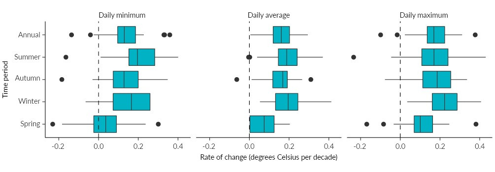
Image: NIWA (Data source)
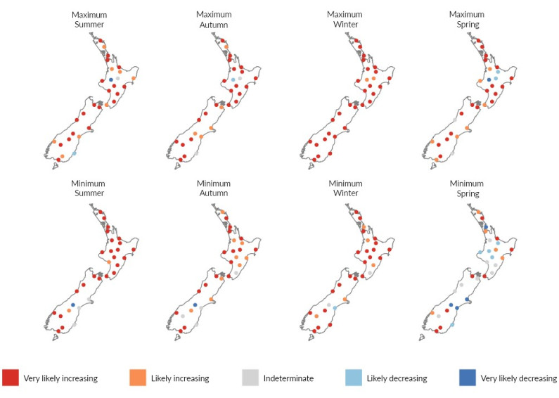
Image: NIWA (Data source)

Image: NIWA (Data source)
The temperature range widened at Lake Tekapo and Timaru, with decreases in minimum temperatures and increases in maximum temperatures recorded. This pattern could be linked to a reduction of cloudiness in the area, with more cooling happening at night. New Zealand is also strongly influenced by the surrounding marine environment, so these observations may be related to the cooler sea-surface temperatures found to the southeast of the South Island (Mullan, Stuart, Hadfield, & Smith, 2010). (See indicator: Sea-surface temperature.)
Growing degree days is a measure that can be used to estimate the length of the growing season for agriculture and horticulture. The measure counts the total number of degrees Celsius that the average temperature is above a base temperature (commonly 10 degrees Celsius) each day. Growing degree days measure heat accumulation, which plants depend on for development, and can be used to predict plant and animal growth.
For 1972–2019, 27 of the 30 sites had an increasing trend in growing degree days (this includes both very likely and likely statistical trends). (See indicator: Growing degree days.) Lake Tekapo had a statistically likely decreasing trend for this period (this may be related to reduced cloudiness as discussed above).
If you are on a mobile device, you can view the graph better on the StatsNZ website.
Average temperatures help define how a climate feels, but it is often the infrequent, extreme events like heatwaves that we notice most. These events are also where the most immediate impacts of changes to the climate are observed. Changes to the intensity and frequency of heatwaves, for example, may have much greater economic, social, and environmental impacts than changes in the average climate (Pearce et al., 2019).
High temperatures can have health and safety implications for people who work and play outdoors, and for people like the elderly who are particularly sensitive to heat (Royal Society Te Apārangi, 2017). Heat can also affect infrastructure such as roading (like when your jandals stick to melted tar on the road) and increase the demand for electricity (because people use air conditioning). Plants, including crops, are affected by heat but their tolerances vary widely. Temperature extremes are likely to influence the range and survival of native and introduced species (Pearce et al., 2019).
The number of warm days (when the maximum temperature is above 25 degrees Celsius) is very likely to have increased at 19 of 30 sites and very likely to have decreased at only one site between 1972 and 2019. (See indicator: Frost and warm days and figure 13.) Among the sites with the largest average increases were Masterton (which gained a week per decade), Reefton (+5.0 days per decade), and Tauranga (+4.8 days per decade). A decrease was observed at Taumarunui, which recorded an average of 4.1 fewer warm days per decade.
The increase in the number of sites with trends in warm days is one of the biggest changes observed since Our atmosphere and climate 2017 among the climate indicators used in this report. Five more sites (19 in total) observed a very likely increasing trend than the 14 sites that were observed between 1972 and 2016.
Heatwave days are a measure of when temperatures are significantly warmer than normal. In this report, heatwaves are defined as three or more consecutive days with a maximum temperature of more than 5 degrees Celsius above the monthly average for 1981–2010. Annual heatwave days is the total number of days in these heatwaves per year. Heatwaves can occur at any time of year – in winter they are known as warm spells.
If you are on a mobile device, you can view the graph better on the StatsNZ website.

Image: NIWA (Data source)
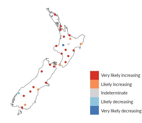
Image: NIWA (Data source)
Inland sites like Tara Hills, Lake Tekapo, Gore, and Masterton were among those with the most heatwave days between 1972 and 2019 (see figure 14). Coastal South Island sites like Christchurch and Timaru can also experience heatwaves, particularly when hot northwest winds blow across the Canterbury Plains.
A very likely increasing number of annual heatwave days occurred at 18 of 30 sites nationwide. Some of the fastest increases were at inland South Island locations. Heatwave days increased by 4.1 days per decade at Tara Hills, 3.0 days per decade at Lake Tekapo, 2.7 days per decade in Queenstown, and 3.2 days per decade in Masterton.
By season, more of the 30 sites had very likely increasing trends for annual heatwave days in summer (14) and autumn (18) than in winter (8) and spring (9, and 1 very likely decreasing trend).
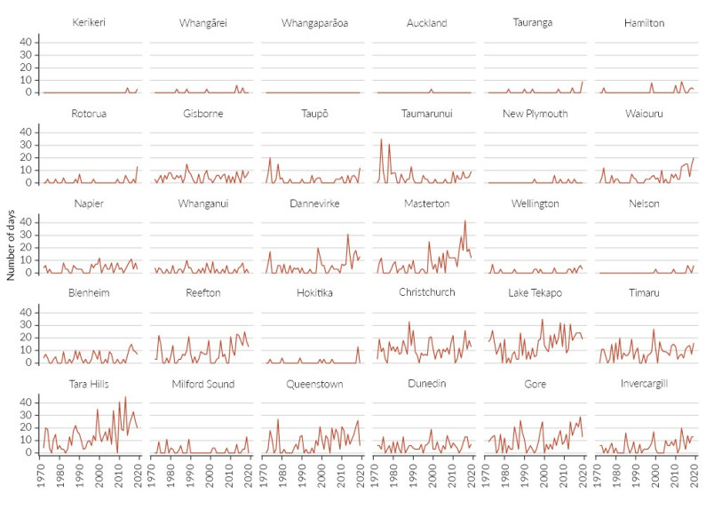
Image: NIWA (Data source)
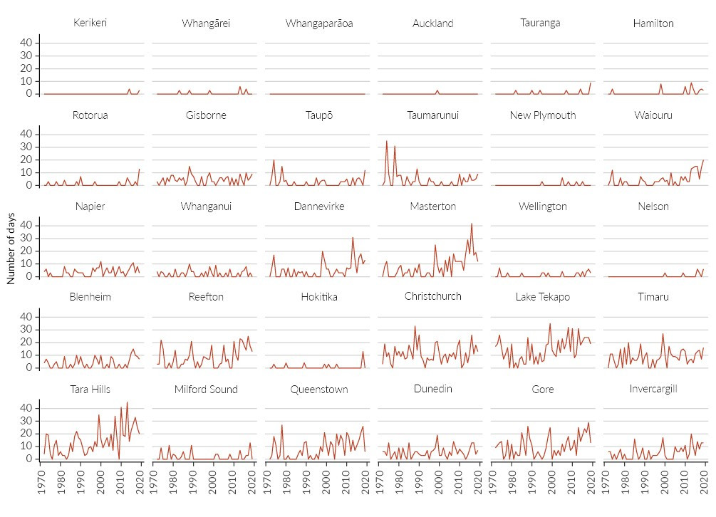
Image: NIWA (Data source)
Our climate is not as cool as it used to be. A frost day occurs when the minimum air temperature is below zero degrees Celsius (rather than a day that has frost on the ground). For 1972–2019, 12 of the 30 sites had a very likely decreasing number of frost days. (See indicator: Frost and warm days.) Nelson and Tara Hills (with an average loss of 5 days per decade) had some of the fastest decreases.
Some places that once had frosts rarely no longer have any. Whangārei never recorded more than two frost days per year but a temperature below zero has not been recorded at this site since 1994. However, Lake Tekapo and Timaru are very likely to have had an increased number of frost days per year.
The dates of the first and last frosts have also changed (see figure 15). Some sites, including Waiouru, Taumarunui, Reefton, Nelson, Gore, Milford Sound, and Tara Hills now experience winter weather for a shorter time on average, with the first frost occurring later in the year and the last frost earlier. Four sites (Taupō, Blenheim, Timaru, and Lake Tekapo) had their first frost day occurring earlier and the last frost day later.
Some plants (including invasive species) cannot tolerate frost so fewer frost days may allow them to expand their range. Cold temperatures are critical for other species because they trigger processes like blossoming in fruit trees. Frost can also be beneficial in killing some insect pests.
Image: NIWA (Data source)
Image: NIWA (Data source)
Almost half of the 30 sites had increasing trends for annual rainfall for 1960–2019 (increases and decreases include both likely and very likely statistical trends (see figure 16 and indicator: Rainfall). One third of the sites experienced less rainfall – many of these were in the northern half of the North Island. Southern South Island and west coast sites (including Milford Sound, the wettest of the 30 sites) had increased annual rainfall. Some of the drier sites – Tara Hills and Lake Tekapo – had different trends in different seasons.
Annual rainfall decreased by an average of 4.3 percent per decade in Whangārei, and 3.2 percent per decade in Tauranga, relative to the average rainfall over the entire period. These were among the largest decreases per decade. It increased by 2.8 percent per decade in Whanganui, 2.1 percent per decade in Milford Sound, and 1.3 percent per decade in Hokitika.19.
If you are on a mobile device, you can view the graph better on the StatsNZ website.
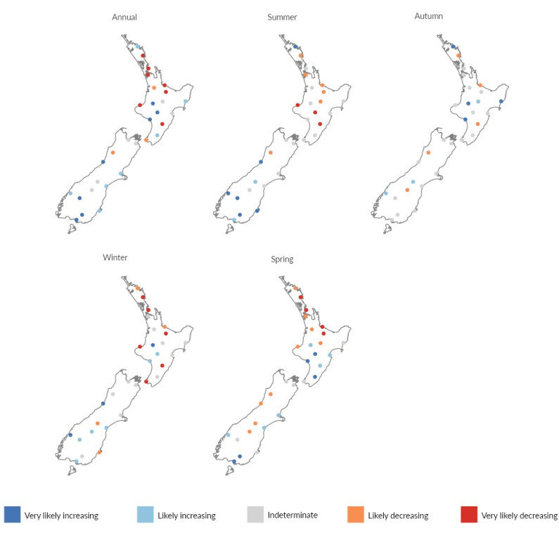
Image: NIWA (Data source)

Image: NIWA (Data source)
Changes in rainfall did not happen evenly across the year. There were increasing or decreasing trends in spring at 24 of 30 sites between 1960 and 2019. Spring is an especially important time of year for agriculture and horticulture. The fewest changes were observed in autumn, when 12 sites had increasing or decreasing trends, and the remaining sites had no detectable trend.
Most sites with increasing rainfall also had more intense rainfall – the rain fell in a shorter period of time rather than being spread out over the year. Most sites with decreasing rainfall had less intense rainfall (see Changes to extreme rainfall are mixed).
Rainfall influences which plants can grow in an area. Most ecosystems are sensitive to changes in precipitation (mostly rain and snowfall). Differences in the long-term baseline rainfall can affect the structure, composition, and diversity of ecosystems (Weltzin et al., 2003). The seasonal timing of rainfall can also have important implications for water supply and management, agriculture and irrigation, hydroelectricity generation, and river ecosystems.
Extreme rainfall events are variable by nature. Because a warmer atmosphere is a more energetic atmosphere (and can hold more water vapour), the water cycle is intensified. This can result in more frequent and intense rainfall. Although trends in the frequency and size of intense rainfall events have been observed, these events do not happen often, so a longer record of data is needed to increase confidence in these findings.
More rain falling in intense events can increase the risk of floods, landslides, streambank erosion, and sedimentation. Flooding from intense rainfall events can cause widespread damage to the infrastructure, social, and economic systems we rely on. Studies that examined recent floods for a link to climate change found that the warmer climate had increased the likelihood of some events – Golden Bay 2011 (Dean, Rosier, Carey-Smith, & Stott, 2013) and Northland 2014 (Rosier et al., 2015).
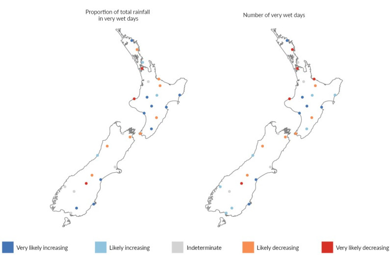
Image: NIWA (Data source)

Image: NIWA (Data source)
The proportion of total rainfall arriving in extreme events (downpours versus light rain) increased at 13 sites and decreased at 11 sites (increases and decreases include both likely and very likely statistical trends) (see figure 17 and indicator: Extreme rainfall). Timaru (+2.0 percent per decade), Kerikeri (+1.6 percent per decade), Napier (+1.5 percent per decade), and Dunedin (+1.4 percent per decade) had among the largest average increases. The proportion of rain falling in extreme events decreased by 1.6 percent per decade in New Plymouth.
The number of days with extreme rainfall increased at 14 sites and decreased at 11. Of the 25 sites with an increasing or decreasing trend, all but two had the same trend in the proportion of rainfall occurring in extreme events.
If you are on a mobile device, you can view the graph better on the StatsNZ website.
Ex-tropical cyclone Trevor hit New Zealand in March 2019, bringing extreme rainfall to the west coast of the South Island. Heavy rain closed part of State Highway 6, caused slips, and destroyed the Waiho River Bridge south of Franz Josef. Stretches of road were damaged over a distance of hundreds of kilometres. This weather event is estimated to have caused $3.81 million of damage in Westland (Westland District Council, 2019a).
A state of emergency was declared, residents and businesses were affected by power cuts, some homes were flooded or evacuated, and one person died (New Zealand Government, 2019a). Stop banks and farmland were damaged, and the floodwaters tore through a disused landfill beside Fox River, exposing rubbish from previous decades (Westland District Council, 2019b).
The effects were widespread. About 135,000 kilograms of rubbish was washed 21 kilometres downstream through Westland Tai Poutini National Park to the Tasman Sea and strewn over 64 kilometres of coastline. Litter in the marine environment is recognised as a global concern – flooding can deliver it deep onto the sea floor and threaten these marine ecosystems (Pierdomenico et al, 2019).
Westland District Council began the massive cleanup operation but handed it over to the Department of Conservation (DOC) in June 2019. (DOC is responsible for the national park, which is also part of Te Wāhipounamu South West New Zealand World Heritage Area). The New Zealand Defence Force also provided assistance.
The clean-up effort, called Operation Tidy Fox, coordinated hundreds of volunteers from across New Zealand and overseas and acted as a receiving point for financial support. Nearly 1,000 volunteers gave their time between June and August 2019, collecting over 134,000 bags of rubbish from the riverbed and coast (DOC, 2019).
Subsequent floods continue to release more rubbish. A feasibility study is underway to estimate the cost of sealing the landfill to stop more pollution. More intense and frequent extreme weather events may increase the risk to landfills that are vulnerable to storms and flooding (New Zealand Government, 2019b; Office of the Prime Minister’s Chief Science Adviser, 2019).
Fox River landfill, which it is believed was closed in 2001, is one of between 110 and 163 closed landfills (compared to 2–3 active landfills) that are vulnerable to the effects of climate change such as sea-level rise (Simonson & Hall, 2019).
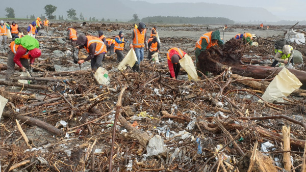
Volunteers collect rubbish from Fox riverbed. Photo: Department of Conservation
Auckland experienced its longest dry spell in early 2020, which finally ended after 47 days (NIWA, 2020). The average length of dry spells in Auckland between 1960 and 2019 was 10 days.
In this report a dry spell is defined as a period of 7 or more consecutive dry days when less than 1 millimetre of rain is recorded on each day. Annual dry spell days is the total number of days in these dry spells in a year. Note that some towns and cities use different time periods depending on their climate. Longer or more frequent dry spells coupled with shortened wet spells or warmer temperatures can lead to drought.
The total number of dry spell days per year increased at 13 of the 30 sites and decreased at 9 sites between 1960 and 2019 (increases and decreases include both very likely and likely statistical trends, see figure 18). Almost all sites with an increasing annual number of dry spell days (most of which were in the North Island and particularly the northern half) also had increasing trends for the number of dry spells. Six of the 9 sites with decreasing trends in the number of dry spell days, and 8 of the 11 sites with decreasing number of dry spells were in the South Island (particularly the lower half) where annual rainfall increased at many sites.
A drought is a prolonged and marked shortage of moisture compared to what is expected. Drought is caused by a lack of rain but high temperatures can contribute because they accelerate evaporation and water loss from soil, vegetation, and waterways. Therefore, high temperatures, low rainfall, and more of the rain falling heavily (with consequently longer dry intervals) can quickly lead to drought conditions.
One method used to detect and monitor drought is the standardised precipitation-evapotranspiration index (SPEI) (WMO and Global Water Partnership, 2016). Because SPEI accounts for the influence of temperature and precipitation on drought it is useful for studying climate change because both are affected. SPEI can also be applied for different time periods (like the past 3, 6, or 12 months) to provide information about the frequency and intensity (drought severity divided by its duration) of droughts.
More of the 30 sites had increasing trends for frequency and intensity of short-term drought than sites that had decreasing trends (as measured using the 3-month SPEI) for 1972–2019. (Increases and decreases include both very likely and likely statistical trends, see figure 21 and indicator: Drought). Thirteen of the 30 sites had an increased frequency of short-term drought, and the frequency decreased at 9 sites. Hamilton’s 3-month SPEI values for example, dipped into short-term extremely dry conditions six times in the past 10 years (see figure 19). Blenheim and Dunedin were among the sites with the largest increases in the frequency of short-term drought.
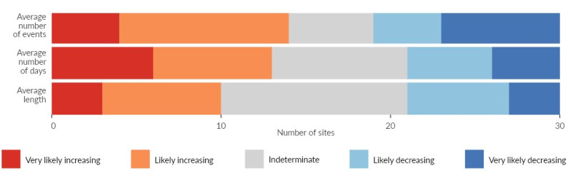
Image: NIWA (Data source)

Image: NIWA (Data source)
The intensity of short-term drought increased at 14 sites, 11 of which were in the North Island. Of these 14 sites, 4 (Auckland, Waiouru, Reefton, and Lake Tekapo) had increasing trends in severity but not duration. This indicates that the drought intensification at those places was likely to be related more to increased severity than increased length. Auckland and Wellington had some of the largest increases in intensity. Nine sites had decreased short-term drought intensity, and of these, 7 were in the South Island.
New Zealand does not typically experience the droughts of a year or more that occur in other parts of the world, but long-term drought (measured using the 12-month SPEI) increased in frequency at 13 sites and decreased at 5 of the 30 sites. Also, more sites had decreases in severity and intensity than increases.
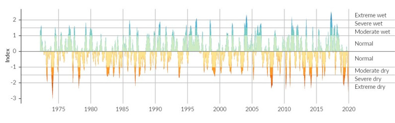
Image: NIWA (Data source)
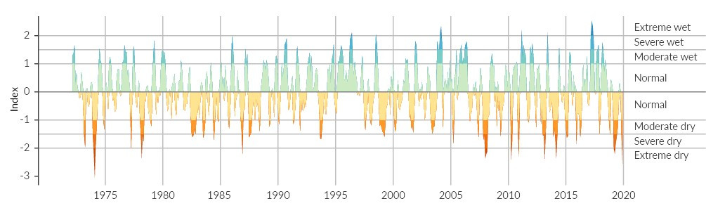
Image: NIWA (Data source)

Image: NIWA (Data source)
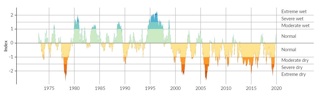
Image: NIWA (Data source)

Image: NIWA (Data source)
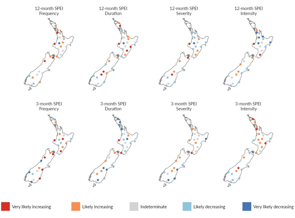
Image: NIWA (Data source)
New Zealand’s native plants typically have low drought resistance, and drought has caused the death of trees in all types of forest (Wyse, Macinnis-Ng, Burns, Clearwater, & Schwendenmann, 2013; Wyse, Wilmshurst, Burns, & Perry, 2018). Freshwater ecosystems can also be affected when less rain results in a reduced amount of stream habitat for fish and other freshwater species.
Long-term drought, such as that experienced in Reefton can be especially stressful for rural communities that rely on rain for drinking water, to grow crops, and water livestock (see figure 20). Urban areas can also be affected by drought. In summer 2020, widespread drought occurred in much of the North Island and parts of the South Island. Water storage dams for Auckland fell below half of their capacity and mandatory water restrictions were put in place. This is one of the most severe droughts to have occurred in this country since the early 20th century (NIWA, 2020).
Because New Zealand is a nation of islands in the roaring 40s, our country is frequently buffeted by strong winds. For 1980–2019, the annual maximum wind gust decreased at 11 of the 14 sites that had enough data to calculate a trend, and increased at 2 of the 14 sites (Gisborne and New Plymouth) (increases and decreases include both likely and very likely statistical trends). (See indicator: Extreme wind.)
The number of days where gusts were extreme for that location (was potentially damaging) decreased at 12 and increased at 2 sites. This observation is counter to climate projections that anticipate an increase in extreme wind speeds, especially in the South Island and the southern half of the North Island (MfE, 2018a).
The observed decrease in potentially damaging wind may be related to changes in the Southern Annular Mode (SAM), a climate oscillation that is associated with storm tracks being shifted towards or away from New Zealand. Since 1970, the wind belt has often been shifted to the south (the SAM has been in more positive phases), bringing an overall decrease in windiness over the country (see Climate varies naturally but natural variations may be changing too).
Our climate is affected by, and affects, other indicators such as sunshine hours and carbon stocks in forests. These indicators were reported in Our atmosphere and climate 2017 and have not been updated for this report.
If you are on a mobile device, you can view the graph better on the StatsNZ website.
In 1997, the volume of ice in New Zealand’s glaciers peaked for the 1977–2016 data record. (See indicator: Annual glacier ice volumes.) Only two decades later in 2016, 28 percent (15.5 cubic kilometres) of the ice had gone, enough to fill Wellington Harbour 12 times.
An unprecedented ocean-atmosphere heatwave in the summer of 2017–18 resulted in the loss of about 3.8 cubic kilometres of glacier ice in the Southern Alps. This was the largest amount of loss in a single year since 1962 (Salinger et al., 2019). New research has linked years with the highest levels of ice loss to human-caused greenhouse gas emissions, finding that global warming made the extreme ice loss observed in 2018 at least 10 times more likely (Vargo et al., 2020).
The volume of ice in New Zealand’s glaciers is strongly influenced by temperature and snowfall. Changes to the accumulation and melting of ice affects the volume of water downstream, which influences the ecology and health of waterways. Water for hydroelectric generation, cultural values, tourism, and agriculture can all be affected.
Sea level is rising as ice sheets and glaciers melt, and because water expands when it warms. New Zealand’s mean relative sea level (based on four long-term monitoring sites in Auckland, Wellington, Lyttelton, and Dunedin) rose 1.81 (±0.05) millimetres per year on average since records began more than 100 years ago. (See indicator: Coastal sea-level rise.)
Not only are sea levels rising, but they are rising faster. The average rate of sea-level rise at the four sites for 1961–2018 was twice the average rate between the start of New Zealand records and 1960.
Globally, mean sea level has risen more than 7 centimetres in just 25 years according to satellite data. The loss of ice from the large Greenland and Antarctic ice sheets has accelerated the rate of global sea-level rise – the rate for 2006–15 was about two and a half times the rate for 1901–90 (IPCC, 2019).
Water around the New Zealand coast warmed by 0.2 degrees Celsius per decade on average from 1981 to 2018 as measured by satellite. (See indicator: Sea-surface temperature.) Higher rates of warming were observed off the South Island’s west coast in the Tasman Sea between 2002 and 2018 (Chiswell & Grant, 2018). Faster warming has also been recorded to the east of the Wairarapa coast since 1981, although the rate of warming varies. Less warming has occurred to the southeast of the South Island (Sutton & Bowen, 2019).
The rate of warming in the upper ocean has accelerated globally since 1991 (Cheng, Abraham, Hausfather, & Trenberth, 2019). There is growing evidence that only a small amount of sea-surface warming is needed to affect the stability of ice shelves in Antarctica, which could result in multi-metre rises in sea level over the coming centuries (Turney et al., 2020).
Higher concentrations of carbon dioxide in the air is also making the world’s oceans more acidic. About 30 percent of global human-emitted carbon dioxide was absorbed by the oceans between 1994 and 2007 (Gruber et al., 2019).
Ocean surface water has become 26 percent more acidic (a decrease of 0.1 pH units) since the beginning of the industrial era (IPCC, 2014a). Subantarctic waters off the coast of Otago became 7 percent more acidic in the 20 years from 1998 to 2017. (See indicator: Ocean acidification.) More acidic seawater can affect ocean biodiversity, particularly species like corals, shellfish, and coralline algae (Kroeker et al., 2013).
The cool, moist environment in many of New Zealand’s forests is a natural barrier to burning. In one version of the legend, Mahuika the Māori fire deity, discovered this as she tried to preserve her sparks using the native rātā, hīnau, kahikatea, rimu, and miro trees without luck (Best, 1924). But when the weather is dry for long periods, bushfires can sweep through our forests and grasslands (Kitzberger et al., 2016).
NIWA (National Institute of Water and Atmospheric Research) operates the fire weather system for Fire and Emergency New Zealand. Using four weather variables, fuel moisture data, and fire behaviour indices, fire danger in New Zealand is categorised into five levels: low, moderate, high, very high, and extreme. When fire danger is very high or extreme, large fire outbreaks are possible, and may require considerable effort to control.
For 1999–2019, 16 of the 30 sites had an annual average of 3 days or less with very high or extreme fire danger (see figure 22 and indicator: Wildfire risk). By contrast, Tara Hills, Lake Tekapo, and Blenheim all had an annual average of more than a month’s worth of days per year with very high or extreme fire danger.
Six of 28 sites where trends could be calculated (Napier, Lake Tekapo, Queenstown, Gisborne, Masterton, and Gore) had a very likely increasing trend in days with very high or extreme fire danger between 1997 and 2019. Six sites (Blenheim, Christchurch, Nelson, Tara Hills, Timaru, and Wellington) had very likely decreasing trends.
Fire is still possible at places that do not have a large number of days with very high to extreme fire danger. Nelson and Dunedin, for example, have a relatively low yearly average (4 and 8 days per year, respectively for 1999 to 2019) compared to other sites, but had large wildfires nearby in 2019.
If you are on a mobile device, you can view the graph better on the StatsNZ website.
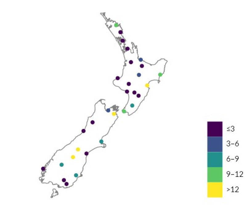
Image: NIWA (Data source)
Image: NIWA (Data source)
More bushfires could radically change our land. Unlike Australia, few New Zealand ecosystems have evolved with fire and most are not adapted to it. Most of our native trees cannot survive even a low-intensity fire (Tepley et al., 2018). Burned habitat can also affect many of our native animals.
The smaller trees and shrubs that are first to grow in burned spaces are also more prone to burning. Coupled with other factors like the loss of seed sources or invasive plants, burned forests may take centuries to recover, and recovery may be prevented in some areas (Tepley et al., 2018).
When vegetation is removed by burning, soil erosion increases. This can increase the risk of flash floods and affect water supplies by filling reservoirs with sediment and debris. Also, when soot from bushfires lands on snow and glaciers, it forms a dark layer that causes the absorption of more heat and faster melting.
The effects on air quality and human health can also be severe and occur far away from the fire itself. The Australian bushfires of 2019–20, for example, reduced visibility throughout this country and helped cause levels of tiny particles (PM10) to exceed national air quality standards in four regions: Auckland, Bay of Plenty, Waikato, and Tasman (MfE, 2020a).
The world’s climate is influenced by natural patterns of change (oscillations) that operate globally or regionally on timescales ranging from months to millennia. New Zealand’s weather and climate is most influenced by three oscillations: El Niño Southern Oscillation (with El Niño, La Niña, and neutral phases), Interdecadal Pacific Oscillation, and Southern Annular Mode (SAM). (See indicators: El Niño Southern Oscillation, Interdecadal Pacific Oscillation, and Southern Annular Mode.)
Although these oscillations are natural, they can be influenced by the greenhouse gases we are putting into the atmosphere. Recent work has found that El Niño events may be shifting – central Pacific El Niño events were more common in the past 30 years than any period in the previous 400 years. At the same time Eastern Pacific El Niño events were less frequent, but were more intense (the most intense in the 400 year record) when they did occur (Freund et al., 2019).
Models project an increase in strong Eastern Pacific El Niño events and the extreme weather they bring (Cai et al., 2018). More work is needed to pull out the recent trends from the long-term natural variations of this climate oscillation.
The SAM oscillation, which indicates how storm tracks shift towards or away from New Zealand, has been changing. Damage to the ozone layer has been associated with more positive SAM phases since 1970, which are associated with winds and storm tracks that are shifted away from this country. Recent research has found that this pattern has paused and slightly reversed since 2000 because the level of ozone is increasing (Banerjee, Fyfe, Polvani, Waugh, & Chang, 2020). Greenhouse gas emissions, however, continue to push SAM towards its positive phase and make future changes uncertain.
If you are on a mobile device, you can view the graph better on the StatsNZ website.

Chapter 3: Changes in our climate and environment are being observed
October 2020
© Ministry for the Environment